Raw-e Jam
It's just fruit!
Roles
Branding, Package Design
Release
2018
The Story
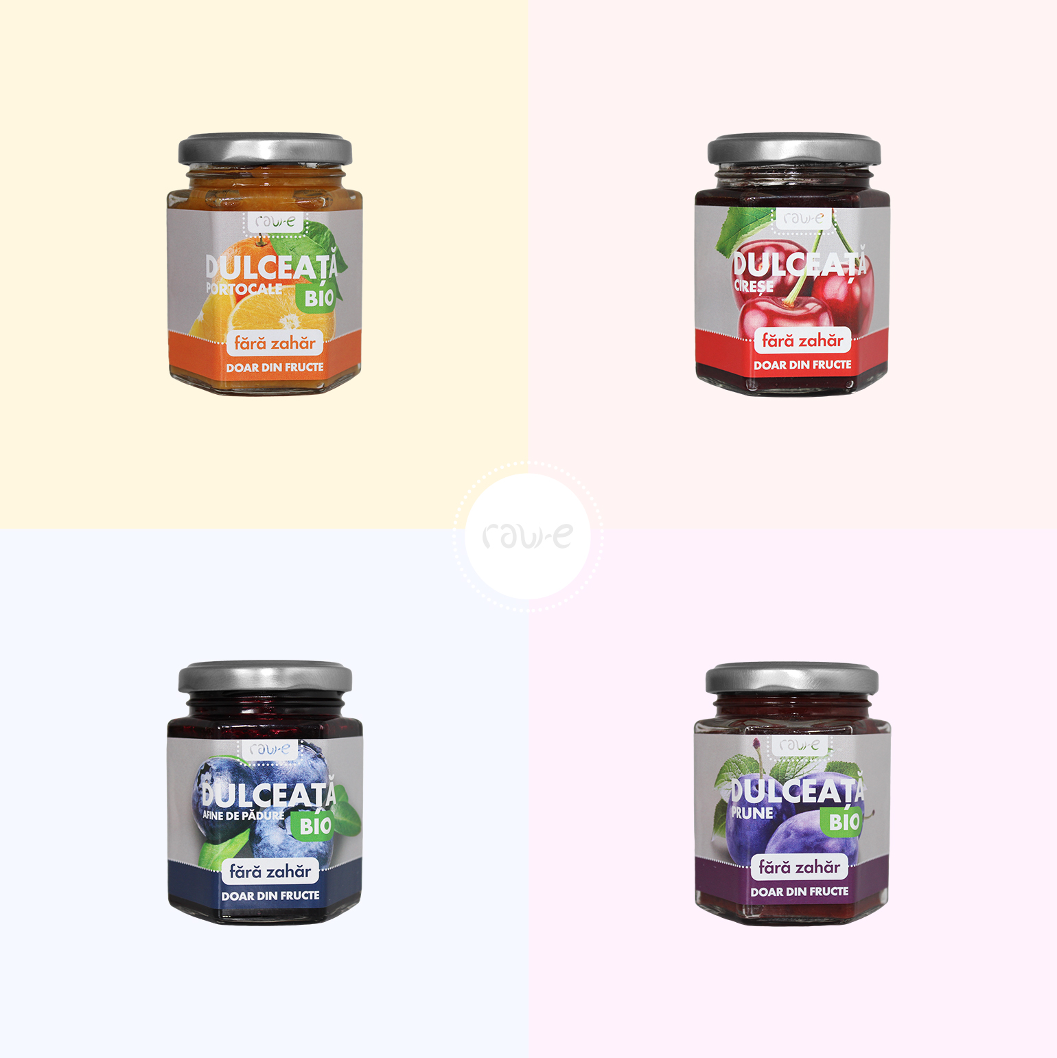
The new line of jam is designed to attract more active followers of proper nutrition, for whom, in addition to a variety of tastes, the free sugar content is especially important. The core of the sub-brand’s target audience are rationalists who want to eat right, follow trends and innovations and are not used to depriving themselves of bright taste sensations.
Logo Design
Main Attributes
Food
Organic
Health
Innovation


Color Palette
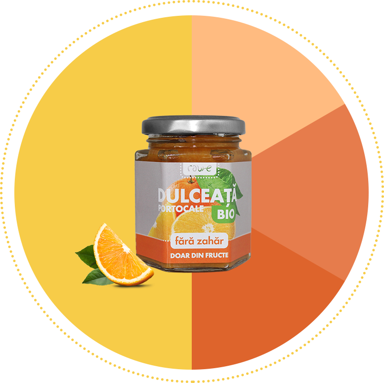
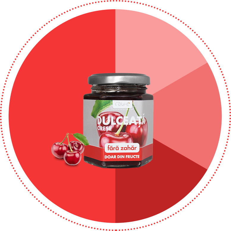
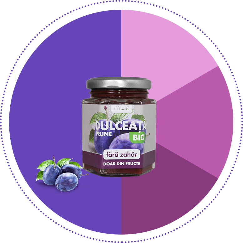
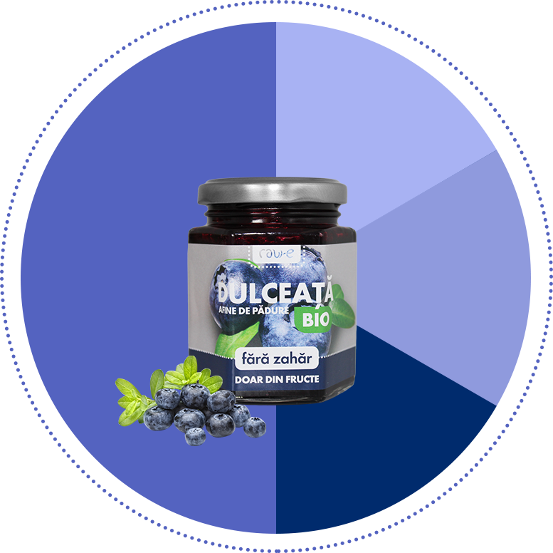
When it comes to jam package design, color is what makes a difference when picking up quickly your favorite fruit mashed in a jar. And to give jam-loving customers a quicker way of jumping on their preferred product, we used a color palette inspired by the natural colors of each fruit.
#f7cc48
#f43636
#6746b9
#5463c0
Mockups
Next project
Copyright 2024 © INK9 Creative Agency. All rights reserved |